
I’ve seen this chart on Professor Scott Galloway’s Linkedin page (I listen to his Prof G show and Pivot podcast with him almost exclusively now) and it is the best visual summary of our mindset options during this pandemic. I’ve spent a few too many weeks in the Fear Zone I must admit, but since I’ve been in the Learning and Growth Zones and it’s been one helluva ride so far!

And this graphic I have no idea where I got from 🙂 but if you are struggling during this isolating time where we are pushed to face our anxieties, fears and reassess our lives, this is a nice visual reminder of the changes we need to make to get back to feeling well.
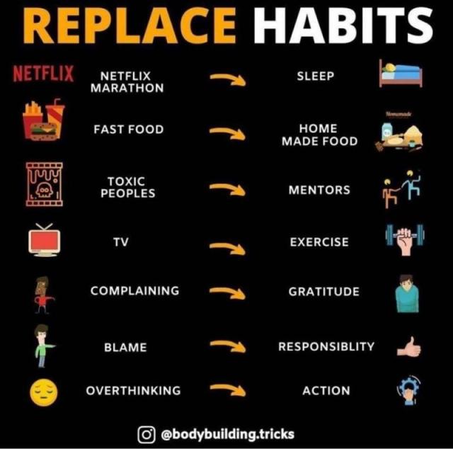

what a wonderful visual
LikeLiked by 1 person
Hi Beth, thank you, hope you are safe and doing well!
LikeLiked by 1 person
Great post 😁
LikeLiked by 1 person
Thank you! Found this chart very helpful also!
LikeLike